
Adding a phone number to a plumbing landing page does not make it easier to book a plumber. In fact, a page with a number, a form, a chat bubble, and a promotional banner often converts worse than a plain one, because each extra channel asks the visitor to decide something before they have decided the one thing that matters: will this company show up.
That decision gets made or lost in the first several seconds, and it gets lost more often through ambiguity than through bad design. A visitor who cannot tell whether a company serves their address, or what happens after they submit a form, does not linger to find out. They leave and call the next result.
Fixing that is not a copywriting problem. It is a specification problem, and it starts with naming exactly what a booking path has to prove at each step.
What Makes a Plumbing Landing Page Convert a Visit Into a Confirmed Booking?
A low-friction booking journey has five visible stages, and each one exists to remove a decision the visitor would otherwise have to make on their own.
- Problem recognition: the page has to reflect the visitor’s situation back to them fast enough that they trust the rest of the page.
- Service-area and availability confirmation: answering whether the company covers this address and can come, before the visitor has to ask.
- Contact-method choice: offering a call, a form, or a chat without making the choice itself a source of friction.
- The appointment request: the actual submission of a request for a slot or a callback.
- Immediate confirmation: a signal that the request landed somewhere real.
Picture the page as a wireframe rather than as copy. At the top sits a headline naming the problem, a phone number, and a line stating coverage and hours. Scroll once and there is a short form or a scheduling widget, not a wall of service descriptions. Scroll again and trust material sits beside the request, not below it. Nothing about that sequence depends on tone or color; it depends on whether each section answers a question the visitor was about to ask.
What Has to Be True Above the Fold
The visible promise above the scroll has to answer three things at once: what problem this company fixes, whether it covers this address, and how fast a response can be expected. A promise that only states the company name and a slogan leaves all three open, and an open question above the fold is a reason to keep searching.
What Reassurance Has to Follow the Action
Once a request is submitted, the reassurance shown next has to state what happens, not just that something happened. “We’ll be in touch” answers nothing. A stated response window, or a next-step description, closes the loop the visitor opened by acting. Reviewing existing patterns in plumbing website design makes clear how rarely this final step gets the same attention as the form itself.
Why Do Plumbing Landing Pages Lose Ready-to-Book Customers?
Most abandonment on a plumbing page is not disinterest. It is unresolved uncertainty, usually about one of four things: whether service is available at all, whether the company covers this specific address, what happens immediately after contact, and whether a submitted request actually reaches a person who can act on it.
A visitor who cannot resolve those questions from the page itself does one of two things. They bounce, which shows up as a short session with no interaction, or they start a form and abandon it partway, which is worse, because it consumes attention without producing a lead.
A form that collects a name and an address but never confirms receipt has not generated a lead. It has generated a question mark sitting in an inbox.
The operational risk runs in both directions. Poorly qualified requests waste dispatch time chasing addresses outside the service area or jobs mismatched to the crew available. Vague availability language creates arrival windows nobody can honor. Missed follow-up on a submitted form converts a near-customer into a public complaint. None of this is fixed by a friendlier headline.
Which Booking Features Must Be Present Before Traffic Can Convert?
A visitor might reach a plumbing page through a call, a chat, or a form, but every one of those routes has to converge on the same place: a managed booking record that dispatch can see and act on. A channel that does not feed that record is not a booking feature, it is a message left in a void, however good it looks on the page.
Google Workspace’s appointment scheduling tool illustrates the underlying requirement well: it lets a business set availability, share a booking link, and have accepted bookings placed automatically onto a calendar. Whatever tool a plumbing company uses, the same three behaviors have to be verifiable, not assumed.
Contact Routes That Have to Work Under Pressure
Three channels carry most plumbing traffic, and each one fails in a different way when it is built poorly rather than simply built cheaply.
- Sticky click-to-call: present on every scroll depth, on both mobile and desktop, and tappable without a secondary confirmation step.
- Text contact, where supported: clearly labeled as text versus call, so a visitor does not dial a number expecting to type.
- Live chat or chatbot: only counts as present if there is an explicit handoff to a human or a request record; a chatbot that loops without escalation is a dead end with a friendly face.
What Makes a Confirmation Trustworthy
A booking system can look complete and still fail at the one job that matters: telling the visitor, in terms they can act on, whether they have a slot or just a submission.
- Online booking system or widget: shows real slots, not a generic “request a time” box with no calendar behind it.
- Calendar integration with controlled availability: the visitor sees only slots that can genuinely be honored, updated in real time rather than on a delay.
- Short booking form: collects only what dispatch needs to route the job, not everything the marketing team would like to know.
- Immediate confirmation: distinguishes a request (submitted, awaiting review) from a confirmed slot (accepted, scheduled, visible on both sides). A page that blurs that line is setting up a dispute later.
How Should Emergency and Planned Plumbing Requests Follow Different Paths?
An emergency caller and a homeowner planning a fixture replacement are not looking for the same page, and a single generic path serves neither well. The urgent visitor needs the fastest possible route to a human; the planning visitor needs enough information to commit to a specific time.
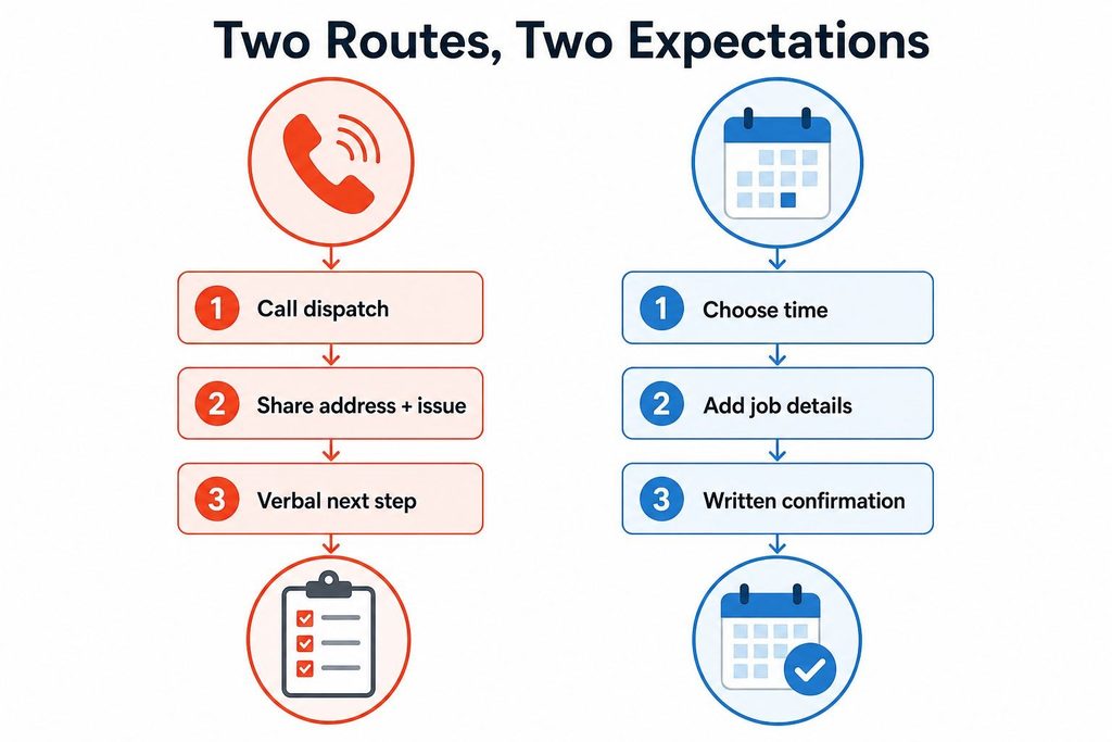
Collapsing both into one call-to-action either slows the urgent caller down with a form, or overpromises appointment precision to someone who was never told how tentative that slot really is. Residential and commercial requests split the same way again inside each category, since a commercial planned request typically carries more qualifying detail (site access, decision-maker, service history) than a residential one, even when the urgency level is identical.
| Path | Primary CTA | Information Collected | Confirmation Expectation |
|---|---|---|---|
| Emergency | Sticky call button, dispatch line | Address, nature of issue, safety flags | Verbal confirmation, no promised time yet |
| Planned Estimate | Request appointment / select time | Job type, property type, preferred window | Written confirmation tied to a specific slot |
The consequence is not cosmetic. An emergency page that leads with a form delays a caller who needed a phone number six seconds ago. A planned-estimate page that implies instant scheduling without controlled availability sets an arrival expectation the dispatch board cannot keep.
What Is the Best Call-to-Action and Form Design for a Plumbing Page?
A call-to-action only works when it pairs an action with an operational fact, not just a verb. “Call now” needs to sit next to something true about urgency and hours. “Request an appointment” needs to sit next to something true about typical response time. “Select a time” should only appear where availability is genuinely controlled by a live calendar, never as a decorative alternative to a form.
The booking form itself should collect the minimum needed to route correctly:
- name
- phone
- address validated against the service area
- job type
- urgency level
In that order, since urgency should determine what happens next. A conditional branch belongs here: if urgency is flagged as emergency, the form should surface the phone number again rather than continue collecting fields.
If the job type is planned, the form can continue to a scheduling step instead. Service-area controls should reject or flag out-of-area addresses immediately rather than after submission, and consent language covering how the contact information will be used belongs near the submit action, phrased plainly rather than buried in a linked policy. Setting the arrival-window expectation on the confirmation screen, not just in a follow-up email, closes the same uncertainty gap that causes abandonment in the first place.
How Does Mobile Optimization Keep a Booking Path Usable Under Pressure?
Most plumbing searches happen on a phone, often from someone standing in a wet kitchen or an unfinished basement, which changes what “responsive design” has to mean in practice. It is not enough for the page to resize. The click-to-call button has to be large enough to hit accurately without zooming, and it has to stay reachable without covering the content someone is trying to read.
Availability and service-area information need to render without a horizontal scroll or a collapsed accordion that hides the one fact the visitor came to check. Booking controls, whether a form or a widget, need to load fast enough that a visitor with a poor connection at a job site does not give up before the fields even appear.
One More Requirement Gets Skipped Often
A form has to preserve entered details if a call comes in or the screen locks mid-fill. Losing a half-completed form to an interruption is a mobile-specific failure with no desktop equivalent, and it punishes exactly the urgent visitor the page was built to serve.
The same standards apply to the between-job visitor comparing three companies on a lunch break. They simply have more patience for a slow page, not infinite patience.
Which Trust Signals Belong Beside the Booking Decision?
Trust material placed in a footer arrives after the decision has already been made. It needs to sit beside the point where the visitor is choosing whether to submit a request, not below a wall of service descriptions they may never scroll to.
- A testimonial section works only when it carries some context: a job type, a rough outcome, something beyond a name and five stars. Review counts and platform context matter more than a single quote, since an isolated five-star excerpt with no source reads as curated rather than earned.
- Certifications or trust badges belong on the page only if they can be substantiated. An unverifiable badge sitting near a call-to-action raises doubt rather than resolving it, because a skeptical visitor notices exactly what cannot be checked.
- A stated response expectation, such as how quickly a submitted request is typically reviewed, does more to reduce hesitation than most decorative trust elements, because it answers an operational question rather than a reputational one.
- A visible after-hours route, even if it is just a note confirming whether emergency calls are answered overnight, closes a question that would otherwise sit unresolved through the whole page.
How Can a Plumbing Team Prove the Booking Path Is Working and Fix It Before Waste Returns?
A generic conversion-rate target says nothing about where a specific page is losing requests. Proof comes from watching the handoff itself:
- click on the phone number
- start on the form
- complete the form
- submit the request
- the eventual booked job, no-show, or cancellation
Each of those is a distinct, trackable event, and a gap between any two of them is a specific problem, not a vague one.
An analytics tool paired with a heatmap tool locates where visitors hesitate or abandon, whether that is a specific form field, a slow-loading widget, or a confusing branch between call and form. Testing should isolate one uncertainty at a time, since changing the call-to-action wording and the form length in the same test leaves no way to know which change mattered.
Before any of that measurement means anything, the basics have to be verified directly, in order of what breaks the most when it is wrong:
- Confirm the primary urgent contact route works on a real phone, on a real connection, without a secondary tap or delay.
- Submit a test request through the booking form using a real address inside the service area to see exactly what the visitor sees.
- Confirm the request reaches the calendar or dispatch system, and that a confirmation message is sent and states a specific next step.
- Record baseline numbers for click, form-start, completion, and booked-job counts before changing anything, so later changes can be judged against something real.
The team running this check should treat each step as pass or fail, not as a general impression:
- Urgent contact route tested on a live phone: done, or not done.
- Test booking submitted from inside the service area: done, or not done.
- Confirmation message received with a stated next step: done, or not done.
- Baseline click, start, completion, and booking counts recorded: done, or not done.
Skipping the first of these costs the most, since a broken call button loses the visitor who was closest to booking. Skipping the last costs the least immediately, but it removes the only way to know later whether anything that gets changed actually helped.